

Tips for Choosing the Right Background for Studio Portraits
When it comes to studio portrait photography, the background is much more than an empty space behind the subject. The right background can complement the subject, enhance the mood, improve visual balance, and help draw attention to the person being photographed. On the other hand, a poorly chosen background can distract the viewer and make an otherwise excellent portrait look flat or unbalanced.
Studio photographers have many background options available, including solid-colored paper backdrops, fabric, painted walls, textured surfaces, muslin, vinyl, and digitally created backgrounds. When it comes to backdrops, many studio photographers prefer canvas backdrops for studio portraits because of their durability, longevity, and ease of use.
Here are some useful tips for choosing the right background for studio portraits.
1. Consider the Purpose of the Portrait
The first thing to consider is why you are creating the portrait. The purpose of the photograph should influence your background choice.
For example, corporate headshots usually benefit from clean and simple backgrounds that create a professional appearance. Neutral gray, white, beige, or subtle blue backgrounds can work particularly well.
For fashion portraits, creative portraits, or editorial photography, you have much more freedom. You can experiment with bold colors, dramatic textures, patterns, or artistic backgrounds.
Similarly, family portraits may look better with warm and simple backgrounds, while conceptual portraits can benefit from more dramatic or unusual options.
Before choosing a background, ask yourself what the final image needs to communicate.
2. Choose a Color That Complements the Subject
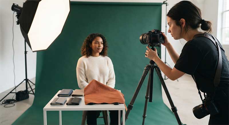
Background color has a major influence on the overall appearance of a studio portrait.
A neutral background is one of the safest choices because it allows the subject to remain the primary focus. Gray is particularly versatile because it can look bright and soft when evenly illuminated or dark and dramatic when less light reaches the background.
White backgrounds can create a clean and high-key appearance, while black backgrounds can produce a more dramatic and low-key portrait.
You can also use complementary or contrasting colors to make the portrait more visually interesting. However, avoid choosing a color simply because it looks attractive on its own. The background should work with the subject’s clothing, skin tone, hair color, and the intended mood of the photograph.
3. Pay Attention to the Subject’s Clothing
Clothing and background should work together rather than compete with each other.
If your subject is wearing a light-colored outfit, placing them against a very light background may reduce separation and make the portrait look flat. A darker or moderately contrasting background can help define the subject.
Similarly, dark clothing can stand out beautifully against a lighter background.
This does not mean you always need strong contrast. A monochromatic portrait, where the clothing and background have similar tones, can also look sophisticated. The key is to make the choice intentional.
Before the shoot, consider asking your subject what they plan to wear. This allows you to select a background that complements the outfit.
4. Think About Lighting Before Selecting the Background
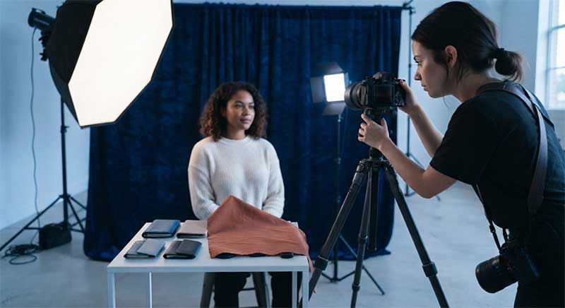
Your background should also work with your lighting setup.
A white background, for example, may require careful lighting if you want it to appear clean and bright. Uneven lighting can create unwanted shadows or gray areas.
A darker background can be illuminated selectively to create gradients and depth. You can also use colored lights to change the appearance of the background without physically changing it.
The distance between the subject and the background is important as well. Moving the subject farther away can help reduce unwanted shadows and give you more control over how the background is illuminated.
Think about the background and lighting as part of the same creative decision rather than treating them as separate elements.
5. Keep Textures Under Control
Textured backgrounds can add character to a studio portrait, but they need to be used carefully.
Subtle textures can provide depth without distracting from the subject. Painted walls, lightly textured fabric, and distressed surfaces can work particularly well for artistic portraits.
However, very strong patterns or textures may compete with the subject, especially in close-up portraits.
If the face is the main focus of the photograph, a relatively simple background is often a better choice. For environmental-style studio portraits, a stronger texture can sometimes help establish the mood and visual story.
6. Match the Background to the Mood
Different backgrounds can create very different emotional impressions.
A bright white background can give a portrait a fresh, clean, and cheerful appearance. A soft gray background can feel elegant and understated. Dark backgrounds can create a serious, dramatic, or cinematic mood.
Warm colors such as beige, brown, or muted orange can create a cozy and welcoming feeling, while cooler colors such as blue or green can produce a calmer or more contemporary appearance.
Think about the emotion you want viewers to experience when they look at the portrait. Then choose a background that supports that feeling.
7. Consider Background Separation
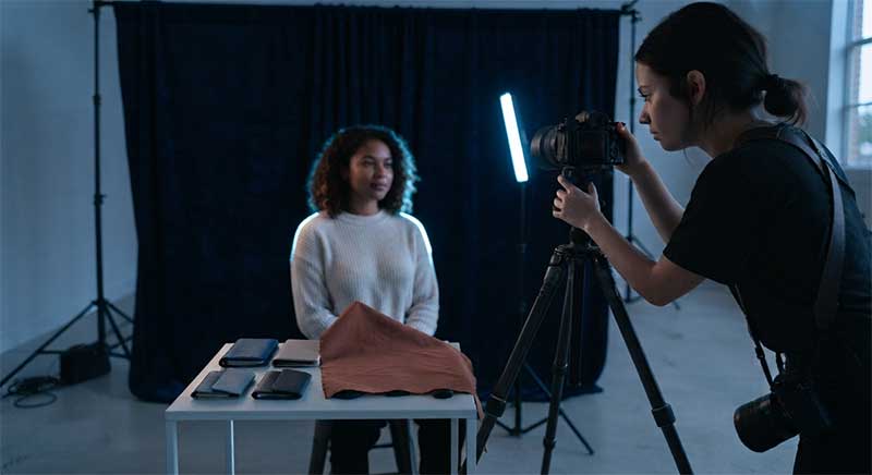
Good subject-background separation helps create a stronger portrait.
If the subject and background are too similar in brightness or color, the edges of the subject may become difficult to distinguish. This can be particularly noticeable around the hair and shoulders.
You can create separation through color contrast, brightness differences, lighting, or depth of field.
For example, positioning the subject farther away from the background and using a wider aperture can create background blur. However, remember that studio backgrounds are often intentionally kept recognizable and controlled, so complete blur is not always necessary.
8. Use Backgrounds to Create Depth
A studio does not have to look completely flat.
You can create a sense of depth by combining the background with foreground and midground elements. Even when using a simple backdrop, positioning the subject at an appropriate distance from it can create better visual separation.
Background gradients are another useful technique. Instead of illuminating the entire background evenly, you can create brighter and darker areas that add dimension to the photograph.
A simple background can therefore become much more interesting through careful positioning and lighting.
9. Have a Selection of Neutral Backgrounds
If you photograph different types of subjects regularly, it is useful to keep several versatile backgrounds available.
White, black, gray, beige, and other muted tones can cover a wide range of portrait styles.
A gray background is especially useful because its appearance can be dramatically changed depending on the lighting. It can appear relatively bright, medium-toned, or nearly black in the final photograph.
Having a small collection of versatile backgrounds can be more practical than purchasing a large number of highly specific colors.
10. Consider the Size of the Background
The physical size of the background is another important consideration.
A background that is too narrow may reveal its edges when photographing subjects from certain angles or using wider compositions. A backdrop that is too short may also create problems when photographing full-body portraits.
For headshots and half-body portraits, a smaller background may be sufficient. Full-length portraits generally require a larger backdrop that extends behind and beneath the subject if you want a seamless appearance.
Always consider the shooting distance, camera angle, lens choice, and intended composition before purchasing a background.
11. Avoid Distracting Patterns
While creative backgrounds can be useful, patterns should be selected carefully.
Highly repetitive patterns can draw attention away from the subject. This is especially true when photographing close-up portraits where the face should dominate the frame.
If you want to use a patterned background, consider choosing a subtle design or positioning the subject so that the pattern becomes less prominent.
Remember that the background should support the portrait rather than become the main subject.
12. Experiment With the Same Background
You do not always need a new backdrop to create a different look.
Try photographing the same subject against the same background using different lighting positions, intensities, and colors. You may be surprised by how dramatically the background can change.
For example, a gray backdrop can look soft and bright with one lighting setup and dark and dramatic with another.
Experimenting with your existing backgrounds can also help you understand how light interacts with different materials and colors.
Final Thoughts
Choosing the right background for studio portraits is an important part of creating a successful image. The background affects the mood, color balance, subject separation, depth, and overall visual impact of the photograph.
Instead of choosing a backdrop simply because you like its color or appearance, consider the purpose of the portrait, the subject’s clothing, your lighting setup, the desired mood, and the composition.
Start with versatile neutral backgrounds and gradually experiment with colors, textures, gradients, and creative lighting. With practice, you will learn how different backgrounds respond to light and how to use them to complement your subject.
